Reading a Histogram in Curves: Brightening the Subject Instead of Trusting the Lights
A histogram becomes useful only when it is read together with the image itself, because in isolation it is just a shape that could mean almost anything.
In the Curves tool the horizontal axis represents brightness — black on the left, white on the right — and the vertical axis shows how many pixels fall at each brightness level. That much is straightforward, but the part that actually matters is understanding which regions of the frame are responsible for the shape you see in front of you, and whether those regions contain anything worth preserving.
In this particular example the photo is clearly dark and the histogram is stacked heavily toward the left side. There is some data on the right as well, but the presence of bright pixels alone does not tell you whether those pixels belong to the subject or to something else entirely — a reflection, a stage light aimed into the lens, a string of LEDs in the background.
The first histogram
In the first screenshot most of the image lives in the darker part of the tonal range, and while there are a few bright pixels visible on the right side of the histogram, they do not belong to the model.
That small cluster of highlight data comes primarily from the stage lighting shining into the lens. The histogram does contain information on the right side, but it is not information that carries any meaningful detail about the subject — the model herself is sitting too far to the left, which is why the image reads as underexposed before any correction has been applied.
Cropping out the misleading highlights
In the next screenshot the bright lights have been cropped out of the frame.
Once the lights are removed from the visible area, the histogram becomes considerably easier to interpret: there are even fewer bright pixels now, and it shows much more clearly where the meaningful tonal information of the image actually sits. Nearly all of it belongs to the darker and middle parts of the range, and the model is simply not reaching far enough into the brighter values to render well on screen.
This is precisely why reading the full histogram without paying attention to what produces its shape can be misleading — a handful of stage LEDs are enough to suggest that the image already contains strong highlights, while the actual subject remains too dark.
About the tool
The screenshots in this article show Snapseed, a free photo editing app available on Android and iOS. However, the same logic applies to nearly all photo editing apps — most of them include either a Curves tool or a simpler Levels adjustment that accomplishes the same thing. The specific interface and names may vary, but the fundamental principle of reading the histogram in context with the actual image remains the same regardless of which tool you use.
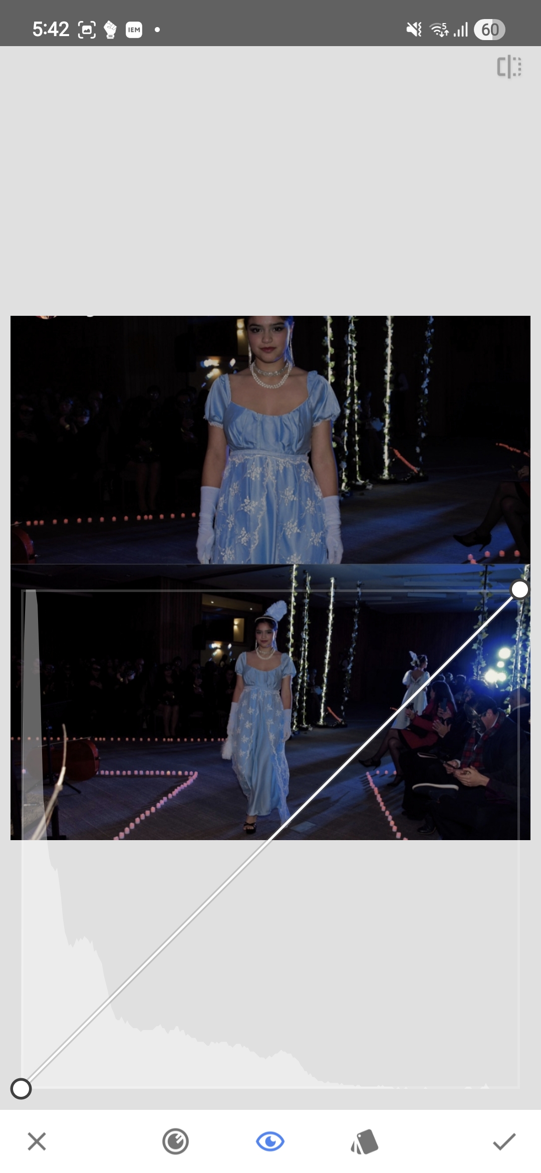
Moving the white point
The correction itself is straightforward: the white point in Curves is moved to the left, roughly to the position where the histogram begins rising sharply.
This remaps the brighter tones of the subject across a wider portion of the available range, and the image opens up very quickly — not because new detail has appeared, but because the tones that were already present are now distributed more effectively across the output values.
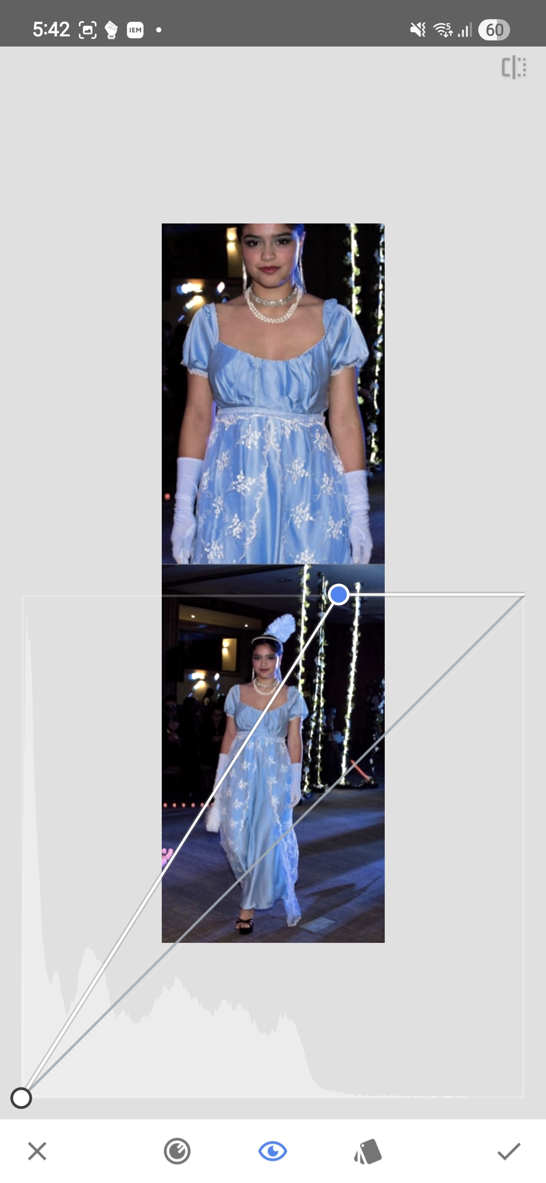
After applying the adjustment and reopening Curves, the histogram looks noticeably different.
The tonal information now covers much more of the histogram. It still does not extend all the way to the extreme right, and there is no particular reason it should — some headroom is normal, and driving important highlights into clipping just to fill the graph to the edge accomplishes nothing useful.
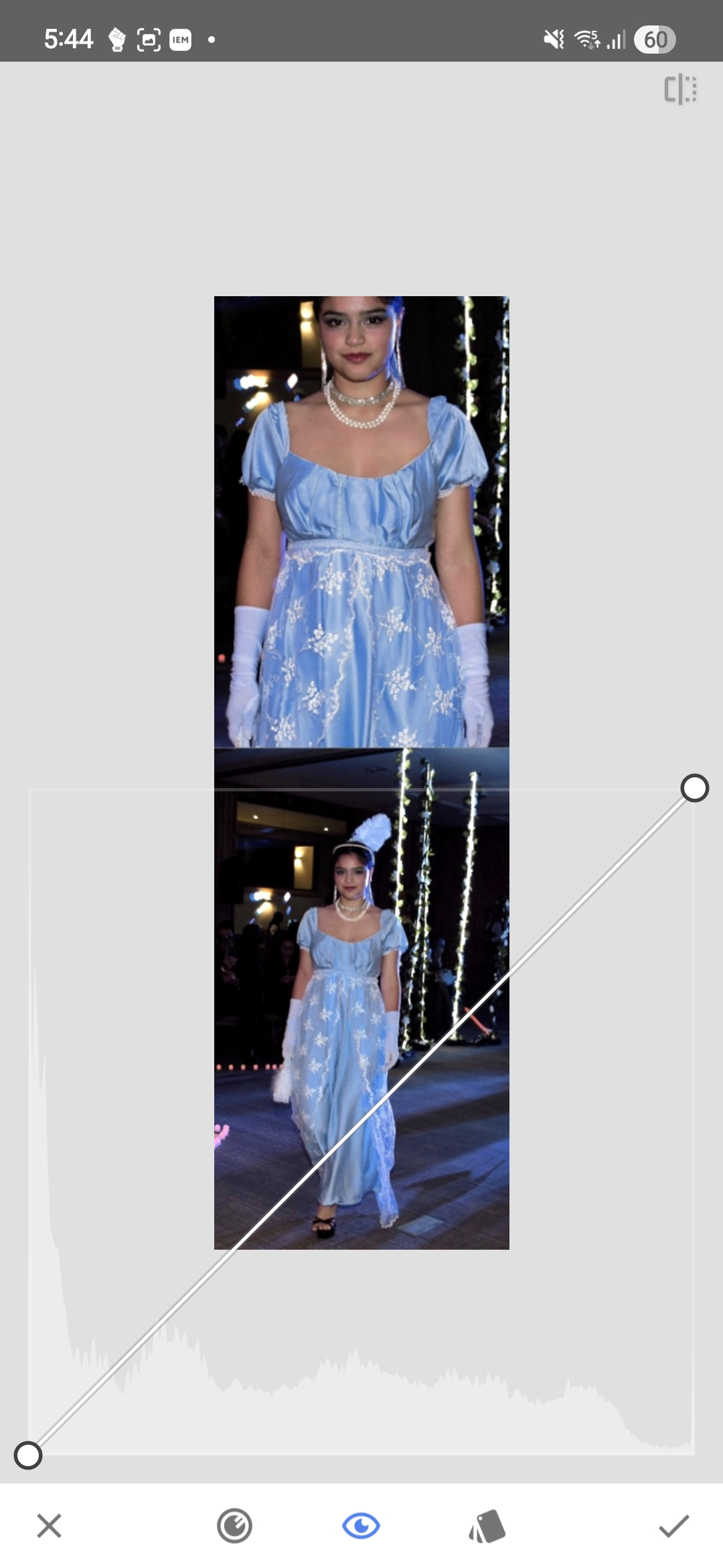
Isolating the brightest pixels
One practical way to verify what the brightest parts of the image actually contain is to move the black point all the way to the right in Curves. This crushes nearly everything to black and leaves only the very brightest pixels visible.
![]()
The result is not surprising: what remains visible is stage lighting, LEDs, and other small bright elements that have very little to do with the model. On the subject herself there are hardly any pixels in that extreme brightness range, aside from a few isolated blue-channel specks scattered here and there.
This confirms the earlier reading — the brightest values in the original frame were not carrying important skin or facial detail, they belonged almost entirely to the lighting setup and the surrounding artifacts in the scene.
Why this matters on a phone screen
When a photo is displayed on a phone it does not appear in isolation — it sits inside an interface full of white text, icons, buttons, and other photos, all of which use the same screen and the same available brightness range.
If the subject is compressed into the darker half of the tonal range without good reason, the photo will appear noticeably darker than the surrounding interface elements and often darker than other photos nearby in the feed. This is not a hypothetical concern: it is entirely possible to produce an image that is technically not clipped anywhere and still looks unnecessarily dim in the context where it will actually be viewed.
This does not mean every image needs to be pushed to pure white highlights. It means that the useful tones of the subject should not be left sitting too far down the scale simply because a few irrelevant bright spots happen to occupy the far-right edge of the histogram.
The same logic inside Instagram
For photos intended for Instagram it is worth looking at the image not as an isolated file but in the environment where it will actually be displayed.
The first screenshot in this sequence shows the Instagram screen as it normally appears — the photo, the UI, text, icons, and the surrounding feed content all visible together, with a Curves histogram overlay.
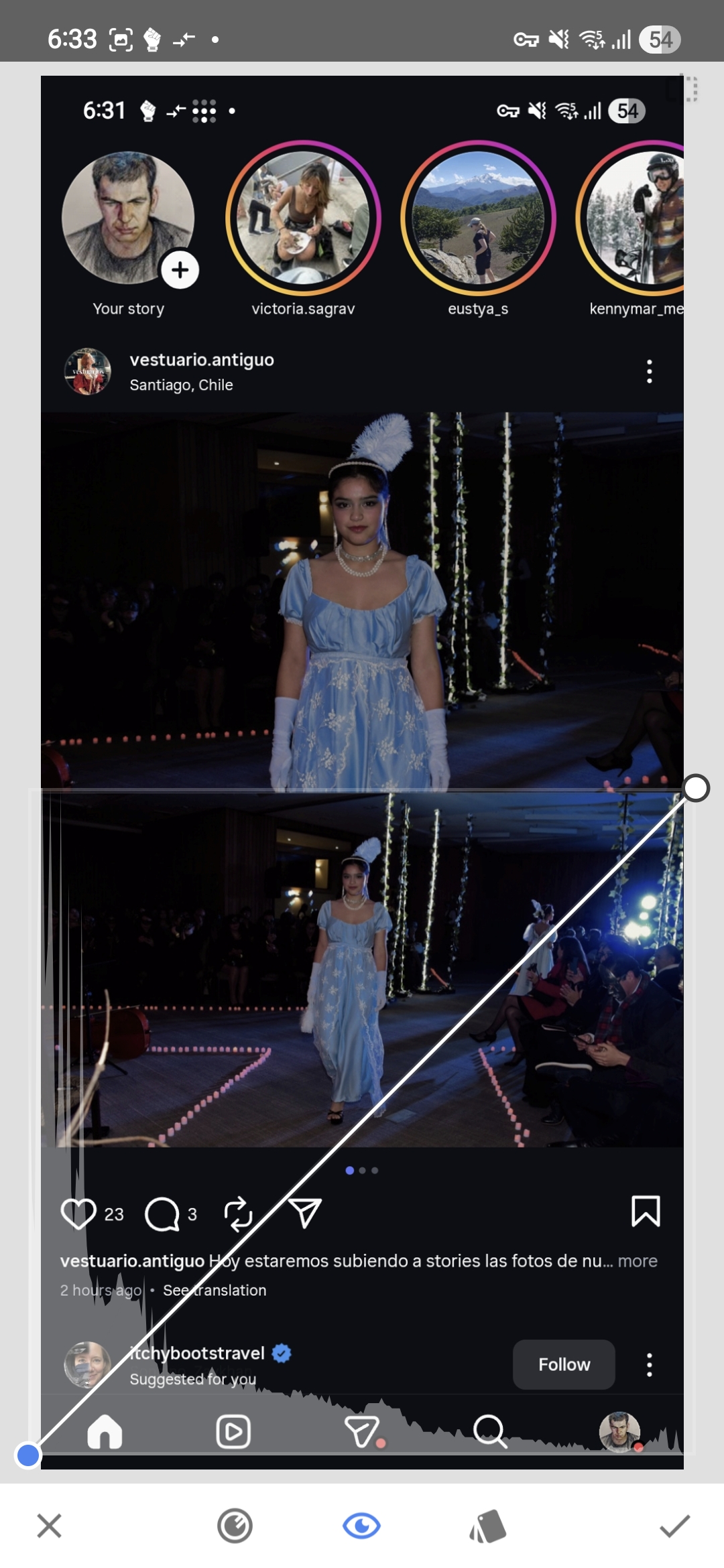
The next screenshot isolates only the brighter pixels by moving the black point to the right until everything below a chosen threshold turns black.
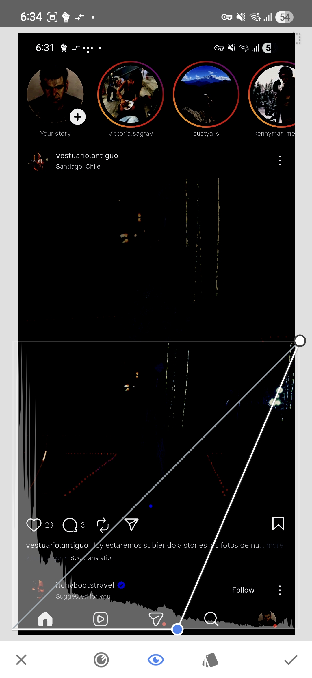
What matters here is not just which parts of the screen disappear, but which parts remain. At that threshold most of the Instagram UI is still visible — the text, the icons, other users’ photos. In other words, the platform elements and the surrounding content are occupying brightness values that the photo in question is barely reaching.
In the next screenshot, instead of using the black point to inspect the threshold, the white point is moved to that same position.
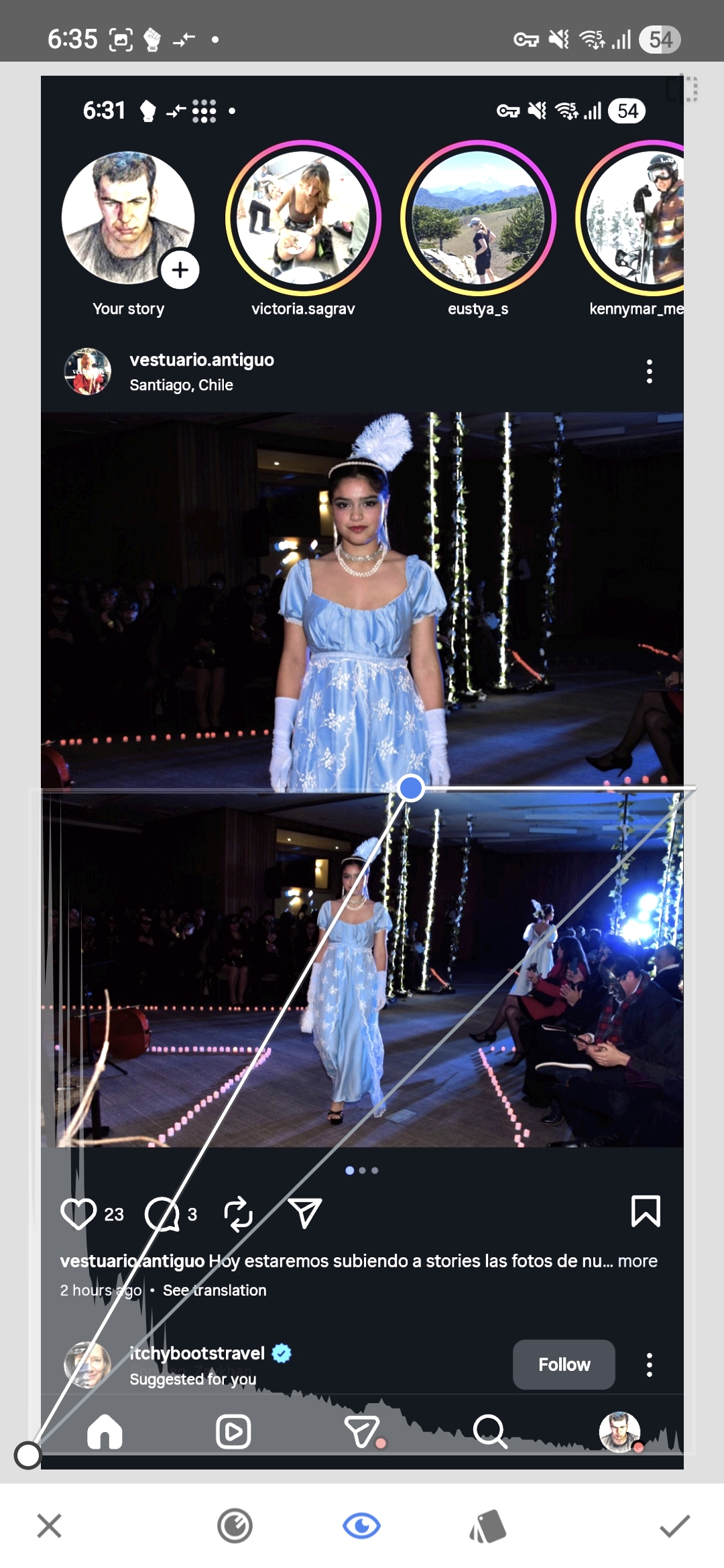
The model is now exposed at a level that reads correctly inside the Instagram interface. The UI elements and some of the surrounding content appear slightly overexposed, but that is expected because they are not part of our image — within the photo itself no important information is lost.
This also serves as a practical measure of how much of the available dynamic range had been left unused. The slider had to be moved almost to the middle of the screen, which is a very large correction and which shows that the original edit was leaving the subject considerably darker than necessary, both in absolute terms and relative to the environment where the photo would be viewed.
The practical question is therefore not whether the file technically contains highlight data somewhere in the frame. The question is whether the tones that fall on the subject are placed high enough in the range to display clearly in the context where the image will actually be seen. If they are not, then the white point can usually be moved much further than one might expect, as long as clipping is avoided in the parts of the image that carry meaningful detail.